

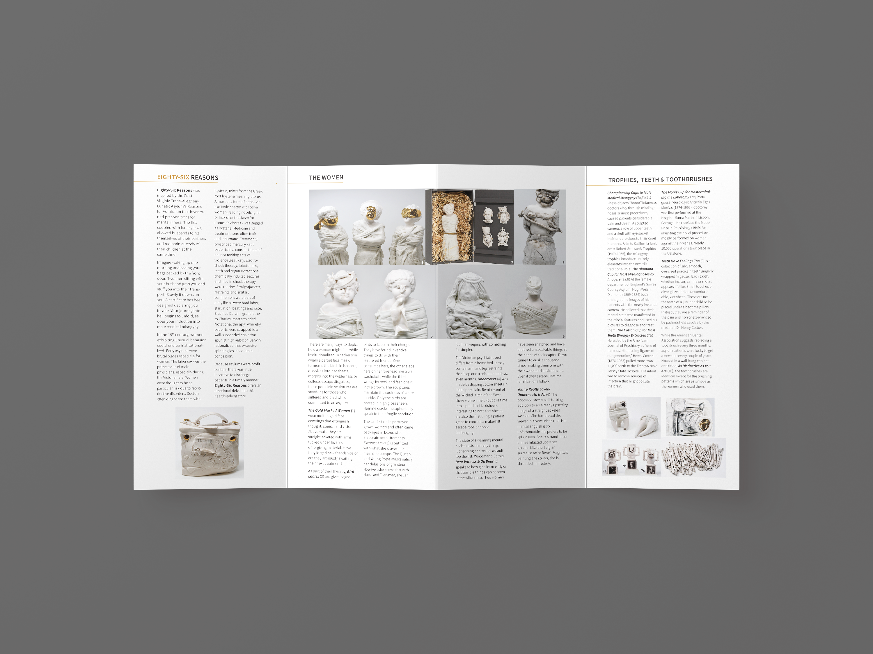
Eighty-Six Reasons Brochure
This pamphlet was designed for a client showing off their art installation. The layout was done by the client before sending it to me. My task was to translate the layout into a pamphlet. The clean black text against the white background was chosen to allow the images of their work to shine. Gold accenting was chosen as a way to accentuate the text and match the gold colors of the images. The gatefold was chosen as four panels were needed to hold the exceptional amount of copy related to the artwork. These pamphlets were handed out at the door of an art installation displaying the same work displayed in the pamphlet. There are subscript numbering on each image that corresponds to a few paragraphs describing the piece and its meaning as described by the artist